After noting how compliments have changed thanks to nearly flawless photographic alterations in the modern digital world (“Wow! It looks photoshopped!”), I thought it would be worthwhile to show the processing I perform on my photographs.
I maintain a deeply-held dislike for time-consuming post-processing of digital images. This dislike does not spring from a purist’s demand for untouched images; rather, it stems from my own impatience for the process and the details. Some photographers perform a great deal of detailed processing, and some of those photographers achieve stunning results; I do what I can with a relative minimum of processing. It’s a matter of taste, and my tastes run toward not putting an ax through my computer on a weekly basis due to impatience and frustration. Some images take more processing than others, but almost all of them stay below my ax-wielding threshold.
Now, since a picture is worth a thousand words (or 1,043.34 Canadian words), here are three examples of my processing; before is on the left, and after is on the right. (Click on the image to see the larger version.)
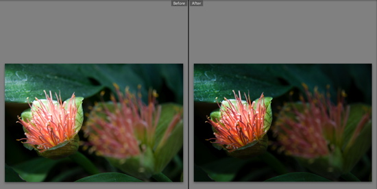
First: an image from the Anna Scripps Whitcomb Conservatory on Belle Isle.
The change in this image is fairly obvious, but it didn’t take much to make that change: in addition to my normal adjustments of contrast, vibrance and sharpening, I brought the exposure down. Take a look at my adjustments. (For comparison, see the default settings.)
It is important to point out that if I were a more careful, more thorough photographer, I might have taken the time to get a lot closer to the “after” picture when I was actually shooting. This will be illustrated in the third example.
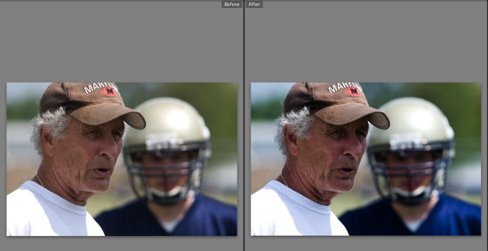
Second: an image from a recent Chelsea high school football camp.
There isn’t much of a change to this image; the original looked just a little flat and washed out, so in addition to my normal adjustments, I bumped up the Blacks slider just a bit. Unlike the previous image, I did not adjust the exposure. Take a look at my adjustments.
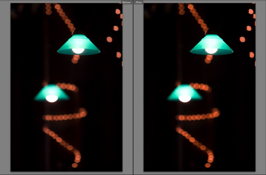
Third: an image from a Great Lakes Myth Society concert.
If you’re having a hard time noticing any significant difference between the before and after images, don’t sue your eye doctor; there really isn’t much of a difference. I did increase the exposure just slightly (in addition to my normal adjustments, of course), but the image was close enough to good that those adjustments made only a very minor difference. Take a look at my adjustments.
For this image, unlike the first image, I was a more careful, more thorough photographer; I took the time to shoot the scene a few times and change the camera’s settings until I finally saw what I wanted. The result? A reduction in necessary processing.
The moral of the story is twofold:
- Post-processing is a part of photography, even for those of us who sometimes (oftentimes) wish it weren’t.
- More work at the beginning often results in less work at the end.
Wrapped up in the second moral is an important principle for those who are lured by the blithe promises of software advertisements:
- Don’t just take a picture and plan to make it good on the computer; take a good picture, and use the computer to make it better.
Also, for those of you who might be curious: I use Adobe Lightroom to process my images.
Finally, the detail-oriented might have noticed that I did not adjust the Clarity slider for the last two images. There is a good reason for that: I processed those images before the Lightroom 1.1 update was released, and Lightroom 1.0 did not include the Clarity slider.


“Also, for those of you who might be curious: I use Adobe Lightroom to process my images.
Finally, the detail-oriented might have noticed that I did not adjust the Clarity slider for the last two images. There is a good reason for that: I processed those images before the Lightroom 1.1 update was released, and Lightroom 1.0 did not include the Clarity slider.”
~What a coincidence, I was just thinking why you didn’t adjust the clarity 😉