
Chelsea hockey faced the Ann Arbor Skyline Eagles. It would have been great if I could have said Chelsea hockey faced the Ann Arbor Schembechler Aviators, but noooooooo, the school board had to be as generic as it possibly could have been. Seriously, I wouldn’t be surprised if all the mail that arrives at Skyline is addressed to “Resident” or “Occupant.” That’s how generic they made this school. It’s sad, really. Where is Skyline High School? Why, just look for the skyline! In…every city…on earth. Who are the Eagles? Why, they’re the sports teams at the local high school…in dozens of towns…across the state of Michigan. WHOA. Way to be proud of your city, school board. You created the store brand of high schools. The Store Brand High School Fightin’ Generics. Go team!
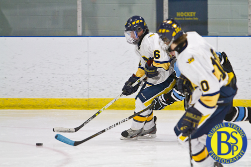
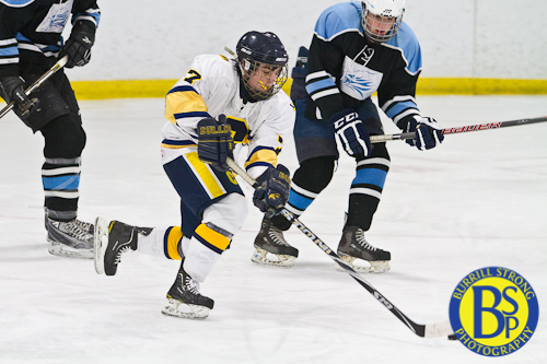
Anyway. Skyline hockey isn’t what you’d call “great” unless your meaning of the word “great” is “undermanned,” so the game got a little lopsided.
“Hooray! Our high school has a meaningful name and our logo is easily recognizable!”
Okay, I know I complained a lot at the beginning of the post, but I’m not quite done. I have very important sartorial complaints. Specifically, I have absolutely no love for Skyline’s colors and logo.
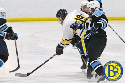
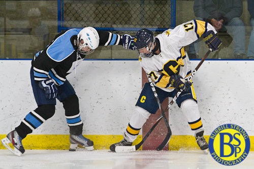
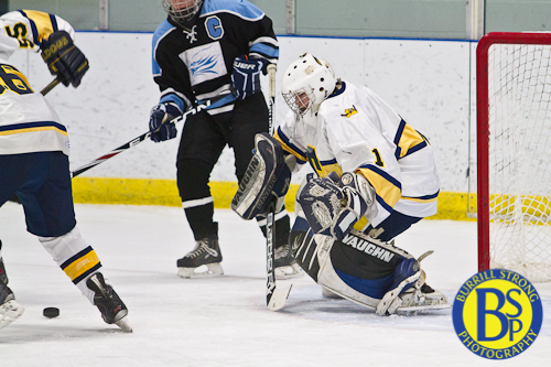
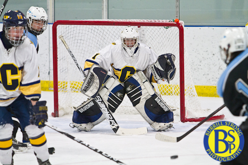
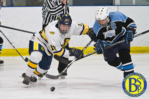
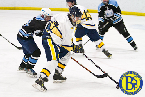
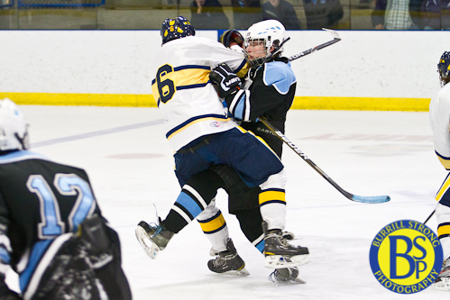
First, the color scheme: it’s actually baby blue and white. Officially I think it’s Carolina blue, but let’s be honest: it’s baby blue. The problem with this color scheme is that it doesn’t lend itself to appealing sports uniforms. (North Carolina basketball may get away with it, but that doesn’t mean you can.) A good color scheme features contrasting dark and light colors so you can produce good home and away uniforms. Baby blue doesn’t contrast with white. No, to the contrary: they’re peas in a pod. Baby blue actually hangs out with white all the time. They go to the clubs together and dance like nobody is watching, primarily because nobody can see them. They both vote the same straight ticket on election day. They like the same awful romantic comedies. The only contrast they know is the setting on their tv.
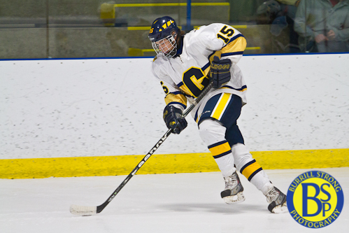
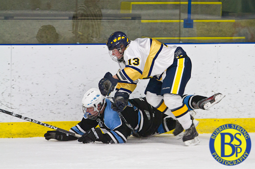
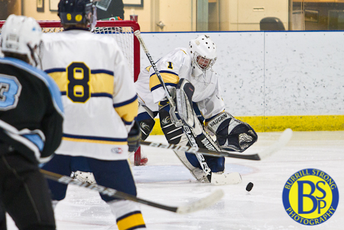
To combat the problem caused by this color scheme, the Skyline hockey folks introduced an actual contrasting color into the away uniform. In the photos it looks like a dark blue; in person it looked dark blue at one moment and black the next. I’m still not sure which color it was. In either case, it looked considerably better than the original color scheme. I’d say it looked 800% better than the original color scheme, but 800% of 0 is still 0, and the original color scheme looks 0 good.
In summary…dear high schools: if you have to introduce a third color to make your color scheme suitable for sports uniforms, you need to pick a different color scheme.
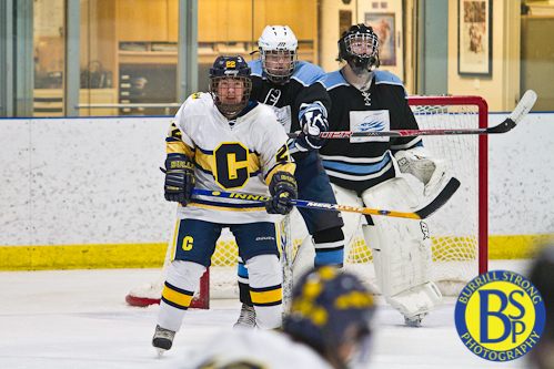
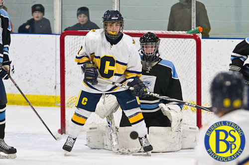
Now: on to the logo. A Google image search for “eagle logo” turned up a few very appealing results. The common traits of the best eagle logos? They’re all simple, easily recognizable at varying sizes and distances, and easily adapted to numerous settings and purposes. The Skyline eagle logo? It’s none of those things. You can see it in many of the above photos, but here’s another look:
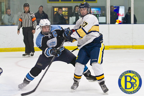
That’s a nice complex artistic rendition of an eagle head that might look great as part of a high school art show. It’s too bad sports jerseys aren’t an art show.
Okay, now I’m done complaining about the Store Brand High School Fightin’ Generics and their ill-conceived color scheme and logo. I’ve been holding that in for a while. I feel better now.
Two things:
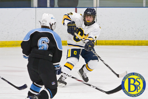
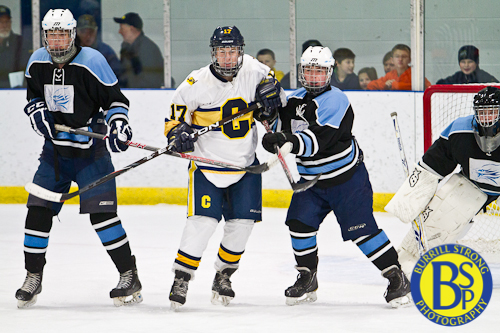
1. As I looked at pictures, I kept thinking “what in the world is that box on the front of Skyline’s uniforms?”
2. As I looked at pictures, I kept thinking that Skyline’s uniforms were black until the last picture in which they looked navy.
Then I got to the end of the pictures and read your rant. Great minds…
The white box was awful. You’d think they could’ve turned the baby blue logo white to show up on the dark jersey. Instead, they put a giant white patch on the dark jersey. It looked homemade, and not in the positive this-food-is-delicious sense of homemade.
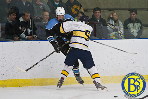
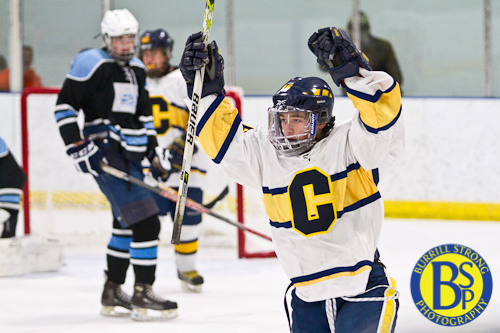
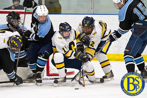
That third picture down looks like some kind of weird family photo.
how many calories in a grapefruit, Woah! I’m really enjoying the template/theme of this site. It’s simple, yet effective. A lot of times it’s challenging to get that “perfect balance” between usability and visual appeal. I must say that you’ve done a superb job with this. Also, the blog loads super fast for me on Firefox. Excellent Blog!